All posts in Uncategorized

Galaxy Nexus PenTile OLED now getting great reviews!

As more people are getting experience with the Galaxy Nexus, PenTile OLED 720HD display the reviews are coming back very favorable. That is because we have now entered the “sweet spot” for PenTile resolution performance where pattern visibility is nearly impossible for most people to see. Anyone who is seeing pattern visibility here is also seeing pattern visibility on many popular RGB stripe displays.

Ron Amadeo of Android Police said:

…First off, forget all that technical Pentile stuff. I want to hate Pentile, I really do, but the screen is just gorgeous. I’m normally the type to complain about Pentile’s checkerboard layout, but the pixels are so tiny I just can’t see it. No one else notices it either, everyone that sees the phone marvels at how good it looks…

http://bit.ly/u0b8Id

Hubert Nguyen of Ubergizmo

Ferris2375: I’ve had numerous phones, GS2, iPhone 4…this is the best screen I’ve seen yet.

LaGgY_42o: Its crazy good, by far the best screen on any device I’ve ever seen, blacks are so black u can’t tell where the phone ends and the screen begins without looking really close. Also u can load up pretty much any page in portrait view with far away zoom and STILL read the really really fine text just fine.

http://bit.ly/u1YPXG

Some have noticed some artifacts at brightness settings of less than 40% described as vertical banding. Others have complained about yellowish displays. Such yellowish characteristic apparently is not appearing in every Galaxy Nexus.

B1ck132 http://bit.ly/t2m8fd

I have 2 Gnexes and all i can say is that the screen is great and the screen is bad.
How?
Well basically one of them have a yellowish screen like most reviewers talked about.
The other though has clear whites, nearly as clear as iPhone screen, which is by far has the best whites on a phone screen.
The one with the yellow tint is useable and still is a good screen but its not great or anything.
The other one though is the best screen I’ve ever used.
So keep in mind that your experinces about the screen might vary depending on your device. As far as i can tell this is actually a known issue with AMOLED screens.

While I am not going to speculate on the cause for such banding or yellowish colors, some bloggers have correctly pointed out that these are not PenTile related artifacts. Nothing about PenTile varies between displays. Nor is there any aspect of the algorithms that is configured in bands.

Still one other dot counter, Flanimal felt that an HD 720 PenTile display was a waste of compute power. http://bit.ly/t2m8fd

…The GPU has to do the work for the full 1280×720 resolution, yet not all of this work is converyed on the display…

This commenter still cannot accept the fact that there are as many pixels in this display as there are in an RGB stripe, despite fewer subpixels. Another way of saying this is that there are as many luminance centers here as for the equivalent RGB stripe. While there is reduction in density of red and blue chrominance centers, these are still in excess of the density that can be seen in the human vision system. For PenTile displays the reduction in the computation better matches what we see. If anybody doubts that we have 720 HD worth of data, you should compare the Galaxy Nexus with a screen full of data to the iPhone 4GS with the identical number of subpixels and quickly prove to yourself that the Galaxy Nexus is capable of displaying much more information.

PenTile for OLED compare to PenTile for LCD

In reading a recent blog http://bit.ly/sIanNL I see that there still seems to be confusion on the value proposition for PenTile between OLED and LCDs. It is very different between PenTile OLED and PenTile LCD. While I have discussed this before in this blog, it is worth reviewing this one more time.

PenTile OLED – reduces current density to improve lifetime while maintaining display brightness

PenTile enables high resolution for OLED. Due to limitations in the luminous efficiency of OLED materials there are tradeoffs between brightness and lifetime. To maintain the brightness of an OLED display without compromising lifetime one has to reduce the current density, i.e the current per unit area of OLED material. OLED lifetime is very dependent upon current density. PenTile eliminates one third of the subpixels and retains the same number of pixels, but when doing this one increases the fill factor of the display. In other words, the ratio of emitting regions to nonemitting region of the OLED display is improved by having fewer subpixels. The net effect is that the current density is reduced, improving the lifetime of OLED displays for comparable brightness. Using subpixel rendering this is all possible without reducing the displays resolution as defined by modulation contrast ratio.

Since OLEDs only consume power where they are lit they are intrinsically lower power for all except images that are predominately white, which is the case even without using PenTile technology. However, it consumes significantly more power to write white images with an OLED than an LCD. On the other hand LCDs have a backlight that remains on all of the time and is only reduced in brightness for darker images based upon global dimming techniques. So, until you define the usage model you cannot say whether an LCD or an OLED panel will be more power efficient.

PenTile LCD – reduces power by about half in high resolution designs

The principal reason for using PenTile for LCDs is to save power. Roughly half of the power can be saved as a result of

1. Improved open area (aperture ratio) which results from using fewer subpixels. Transmissive regions increase in size while the area devoted to opaque transitors and capacitors remain as before, so the opaque regions are a smaller percentage of the total area of display in a PenTile design.

2. Clear (white) subpixels are regions where there is no color filter to absorb light. Since photos, video, and ebook content is heavily weighted to white this becomes an important factor for saving power. ( Note: I will discuss this in more detail in another blog soon.)

3. A type of global dimming which we call Dynamic Backlight Control (DBLC ) looks at peak luminance of images as well as the presence of high luminance fully saturated color and uses this information to reduce backlight power without introducing color or clipping artifacts.

The net effect is that PenTile LCDs can save half of the power for high resolution designs. This can improve both amorphous silicon as well as polysilicon LCD designs.

PenTile OLED in the new Galaxy Nexus

It was great to see the review from Charlie White from Mashable Tech of the Galaxy Nexus with the 720 HD PenTile OLED display http://on.mash.to/vCBPxF

With that large size comes a gorgeous screen. If the term “1280 x 720-pixel Super AMOLED high-definition display” doesn’t mean much to you, suffice to say that even when a screen measures a huge 4.65 inches diagonally, that high number of pixels is still tightly packed onto the screen, resulting in an exquisitely sharp view. If a screen were any sharper than this, it would be hard to tell the difference unless you had super-human eyesight.

Milestone 100

From the time that a PenTile display first appeared in a KDDI phone using a Samsung PenTile OLED display, I began the count of products that used PenTile. Identifying each of these products has presented some challenges, since not every product that has used a PenTile display has advertised the use of PenTile technology. In some cases it was pointed out by customers and bloggers. In others, I had to find the product on the shelf and examine it with my pocket microscope to be sure. My guess is that I may have missed some products that have used PenTile, but as of last Friday my running count came to a milestone of 100 unique products. This included 79 smartphones, 17 digital still cameras, one mini-tablet, and 3 other miscellaneous applications. This count includes both PenTile RGBG OLEDs as well as PenTile RGBW LCDs. The adoption of PenTile technology has accelerated over this past year. As the drive for ever increasing resolution outpaces the ability to achieve energy efficient high resolution solutions, PenTile technology will continue to find homes.

PenTile for 720 HD OLED Smartphones

With the introduction of the 4.65-inch 720 HD OLED, people have now figured out that Samsung is still heavily invested in using PenTile OLED technology for high resolution applications. The reality is that this is the only way to achieve 300 dpi OLEDs. When people try to compare this technology to other panels it is not possible to compare a PenTile OLED at this resolution to any other high resolution RGB stripe OLED for one reason. Such RGB stripe OLEDs do not exist . Such technology is not possible.

When people say that this is a low cost alternative, they have it entirely wrong. It is not less expensive to make and there is no high resolution alternative. We only wish it were lower cost, but so far that has not proven to be the case. Yes, a 720P OLED could be made, but only if it were one-third larger diagonal, which no doubt would most likely be more expensive. The use of PenTile technology for OLED has been to achieve high resolution for OLED, plain and simple.

One blog http://techcrunch.com/2011/10/20/the-scourge-of-pentile-returns-with-the-galaxy-nexus/

by Kevin Coldewey of Techcrunch says, “..For me personally, it’s a deal-breaker sight unseen…” How can someone who claims to be an expert criticize a technology without seeing it? PenTile has been continually improved and now is being used at a level of dot pitch where it makes more sense than ever. Still Mr. Coldewey is quick to criticize without the benefit of looking at it with his own eyes.

In this same blog, Mr. Coldewey shows our diagram that demonstrates how it can get resolution with one-third fewer subpixels, but then asks, “Does it seem logical to you that a display can increase the number of pixels created by a number of sub-elements by a third and suffer no ill effect?” First of all I should point out that Nouvoyance never said that there were no differences between RGB stripe and PenTile displays, but that we have designed them to work well with the human vision system to take advantage of the ability to discern high resolution for luminance. The human vision system has far less resolution for chrominance, so any relative loss of chominance resolution by PenTile is of little impact. In short, PenTile displays are designed to look virtually the same as RGB stripe displays when applied to high resolution formats. Through the use of subpixel rendering, along with some very effective image processing algorithms, we have achieved the ability to make displays that have superb performance at high resolution.

The analogy would be image compression. Does it seem logical that the electronics industry can achieve image compression, allowing high quality images with so much of the raw data removed? Perhaps to the uninitiated it seems illogical, but to the well informed it is totally logical. The same is the case for those who are well trained in the principles of imaging science when they fully grasp the principles of PenTile image processing technology.

Again we are seeing people going down the path of counting dots and trying to discount the resolution that is published in the spec. This has been covered many times in the past and can be reviewed on this blog http://pentileblog.com/?p=712 and http://pentileblog.com/?p=809 where we show how this panel meets the only industry spec for display resolution from VESA http://bit.ly/qLX9Xf . I also have published http://pentileblog.com/?p=778, a reference to an article by the industry icon, Alva Ray Smith, written in 1995, well before PenTile. This article makes the case very clearly that pixels are not little squares of red plus green plus blue dots. Instead, a pixel is a simply a point plus a reconstruction filter. It is nothing more. PenTile uses an area resampling methodology that uses such a reconstruction filter to bring the desired luminance to each and every pixel in the display. Color resolvability, albeit less than luminance, also can be realized at this spec. The human vision system can resolve far less accurately the position of color than luminance so it enables PenTile to be an engineering solution that is fit for use.

Perhaps the biggest and most valid criticism of PenTile technology has be pattern visibility since the pattern is one-third larger than that of RGB stripe. As we get to these very high resolution formats such pattern visibility disappears. It is only easy to see the differences between RGB stripe and PenTile through the use of magnifiers. Yes it is different than RGB stripe, but it doesn’t matter. One has to doubt the credibility of the pundits who are so quick to criticize PenTile before they even take their first look at these panels.

My hat is off to to Daniel P at PhoneArena.com http://bit.ly/nDAdaq who provided a well-studied and balance review of PenTile OLED in this application. As he pointed out, we have been very open about the benefits and deficits of PenTile technology and will continue to do so. We will however continue to provide corrections when the technology is falsely implicated in artifacts that are not caused by PenTile.

One valid criticism of these new panels is that the white point is a little too blue. This is not a PenTile issue, but rather a design choice of the panel maker since such a bias toward blue favors the lifetime of an OLED panel . This is true for both PenTile OLED and RGB stripe OLED, so it would be good if people would stop attributing this to being a PenTile artifact. Likewise, there has been some criticism of color shift off axis for PenTile OLED. Again this is not a PenTile artifact, but is a result of thin film interference in the OLED layers. This would be the case with an RGB stripe OLED just as it is for PenTile OLEDs.

Another invalid criticism is that of banding . That was an issue last year with the original Nexus One when 5-6-5 color depth was input into the 8-8-8 PenTile engine for certain SW applications. These new products are, to the best of my knowledge, all 8-8-8, so there is no banding to be seen. If people claim this is still present, they need to provide some evidence rather than just conjecture.

It is our impression that consumers will be delighted with the new PenTile OLED panels in the 720P format. The industry is now coming into the sweet spot for PenTile technology. Do yourself a favor and go look at this with your own eyes rather than taking the word of those with a predisposed bias and an anti-PenTile agenda.

Visual Adaption - How PenTile Technology Grows on You

I never ceases to amaze me what people can become used to. One example would be orthodonture. How can a mouth full of brackets and wires be tolerated by so many teenagers? What begins as discomfort soon become part of the background experience that is barely noticed.

Experiments with more radical perturbations have had surprising results. People wearing lenses that invert images can adapt to this radical change in perception and see rather normally over time. In fact, the removal of these lenses leads people to believe that they are now seeing normal images as inverted.

Adaption can also play a role in display technology. CRTs had very evident horizontal raster lines which people stopped seeing over the years. In the 1990s when CRTs were first being replaced with LCDs it was apparent to so many people that the LCDs were arranged with vertical color stripes which were far more distinct than the horizontal raster lines of CRTs. Many complained that these lines were bothersome. In time, however, the worst of critics adapted to these stripe artifacts for LCDs and no longer saw them. What happened to the lines that were so bothersome only a short time before?

The fact is that the human vision system and the human brain is capable of developing filters for those portions of an image which are always there, and learns to look strictly at only the data that is being updated. Such an adaption filter can be very helpful to remove these sources of annoyance.

For PenTile there is a pattern visibility that is different than the patterns seen in RGB stripe displays. That which can initially be bothersome doesn’t change with the image data, so here again the eyes and brain are capable of developing filters that remove the pattern visibility of PenTile and allow the user to see only the image information that is changing. I have seen such references repeatedly in recent weeks. People comments generally sound like, the pattern in PenTile bothered me when I first got the phone, but now I don’t notice it at all unless I go out of my way to look for it in an image. This is simply adaption.

TopazAaron

At first you will noticed the patterns in the whites and stuff. (I actually liked it) but anyway. after a while of you using this device. the screen grows on you. I personally lost site of the patterns. so its like there not even there. And this screen is freaking bright. i have mine set on %30 and its just as bright as my sisters inspire 4g on full brightness.

but to me i love it.

I’m sure you wont be disapointed. I watch netfilx alot and it doesn’t bother me at all. its actually nice.

Vision scientists have long been aware of this phenomenon. To understand this in more detail you can check out this link http://bit.ly/qa7sIU Here it says, “…If you stare at a pattern for a long period of time (usually 1 min is sufficient) the visual system becomes adapted. The processes underlying adaptation are not fully understood. Adaptation may be passive (neurones become fatigued) or active (recalibration). However, what is clear is that adaptation to a high contrast pattern has the result of making it more difficult to see a low contrast pattern…”

Not everyone adapts so readily, but most people will adapt given the time and opportunity. Given that PenTile RGBW s is the most significant savings that can be afforded a smartphone, many have felt that it is worth the wait to allow adaption to occur. Those who have done so have appreciated the benefits of superior outdoor viewability and much bright displays without the penalty of short battery life.


Many Beginning to Appreciate the Value Proposition for PenTile

It has been interesting to read the wide variety of blogs that have opinions about PenTile technology. We recognize that the technology is not a one-for-one replacement for RGB stripe, but rather a methodology to preserve resolution while achieving better than average brightness and long battery life. Many have noticed that it works far better outdoors than other phones. This is largely due to the white subpixel and improved aperture ratio. Others have found that when they stop looking for the differences they stop seeing it. There are, however, still a few who remain unconvinced.

Here is an interesting string that shows how divergent the opinion is on this topic:

http://forum.xda-developers.com/archive/index.php/t-1262518.html

Recently I have noticed some bloggers going back to the statement that PenTile technology has being dropped by Samsung in favor of RGB stripe http://www.tested.com/news/droid-bionic-vs-htc-sensation-4g-vs-samsung-galaxy-s2/2855/. That simply is not the case. Samsung continues to manufacture many PenTile OLED and PenTile RGBW LCDs. The reason for the choice of RGB stripe for the OLEDs in the Galaxy S2 are because a WVGA display in larger than 4-inch diagonal goes below the dpi that is recommend for PenTile in phone applications and may even look pixelated for RGB stripe http://pentileblog.com/?p=444. For higher dpi you may see more new PenTile OLED and PenTile RGBW products from Samsung in the future where PenTile display still remain an enabler. However, we fully expect that for future products, where the dpi is below our recommended minimum, that RGB stripe displays will be used.


What is Pixelation?

Often, I am reading blog comments that say that PenTile is pixelated. While this is a perfectly valid word, it has traditionally been used to describe the situation where information is being display on a display of too low resolution causing blocky looking fonts and lines. Pixelation has, for example, been used to obscure or make anonymous faces, license plates and logos as in the photo from Wikipedia below

Pixelized Photo (Wikipedia)


For fonts however it generally degrades the appearance of crispness of edges. It can be remedied or reduced by either going to a higher resolution display or by some type of anti-aliasing technique such as ClearType (Microsoft).

An example of text that is pixelated is show below along with a section that is magnified for better illustration.

Subpixel rendering generally smooths such edges, much like ClearType. If anything it reduces pixelation. What people are seeing that has been described as granularity or screen door effect would more correctly be described as pattern visibility. Such pattern visibility will become less apparent as PenTile is applied to increasingly higher dot pitch screens such as HD in small formats for WQXGA on 10.1″ diagonal tablet screens.

Pixelated Text on RGB Stripe LCD

Magnified image of the the word "The" from above.

Building a Color Display Based Upon What the Human Vision System (HVS) Can See

There has been some confusion about how the human vision system resolves image information. To understand this properly, one has to think about luminance information separately from chrominance information as our eyes handle this data very differently. Shown in Figure 1 is a 3D plot of luminance contrast sensitivity showing that the typical human vision system (HVS) loses all sensitivity at about 30 cycles/degree in both horizontal and vertical directions {note: this varies between individuals}. 30 cycles/degree means that over one degree of arc that typical human vision can resolve and detect as many as 30 line pairs of black and white lines. This corresponds to a 4.0-inch qHD (960 x 540) display viewed at 32 cm distance. This same data is represented on a 2D isoplot as Figure 2 below. Here you can also notice that we actually resolve a little less along the diagonal.

Figure 1 - 3D Luminance Sensitivity Plot for Normal Vision

Now let’s consider chrominance information in Figure 3. You will see two other lines representing the maximum resolution of 8 cycles/deg that can be perceived for colors along the red/green line and 4 cycles/degree along the blue/yellow line (rolling off to zero by 14 cy/degree and 10 cy/degree respectively). The conclusion from this data is that chromatic data does not need to be so well localized as does luminance data and the vision systems will not be able to tell.


Figure 2 - 2D Luminance Sensitivity Plot


Figure 3 - 2D Plot of Normal Sensitivity to Spatial Frequence Based Upon Chrominance


Now let’s talk about how to build a high resolution display from scratch using what we know about human vision. A first step could be to begin with a simple black and white display as shown in Figure 4. In this case there is one subpixel per pixel and you would be able to turn on and off any pixel to achieve any gray level, but with no chrominance information. For now, let’s assume that this display has a dpi corresponding to 30 cy/degree.

Figure 4 - A simple black and white display

As a next step, we could take every other pixel and replace that white pixel with 3 subpixels of red, green, and blue as shown in Figure 5. In this case the luminance of the white subpixel is designed to equal the sum of the luminance of the R+G+B subpixels. If you turned these subpixels fully on you would see a white screen. This display still has chromatic resolution at the same 30 cycles per degree in the horizontal and vertical, but the resolution in the diagonal, the direction that has the lowest sensitivity, is reduced by half. Given that the HVS can only resolve colors at less than half the resolution of black and white, with a display pitch of 30 cycles/degree of pixel pitch in the horizontal and vertical. On the diagonal, adjacent lines are actually spaced closer than on the horizontal and vertical. Specifically the line pitch is increased by the square root of two, or 42 cycles/degree , your color data would be at half that, at 21 cycles/degree, in the diagonal direction, which is more than sufficient. Unfortunately, we have higher pitch in a direction where the HVS is less sensitive, so this excessive resolution.

Overall, you would have everything you needed to represent everything that the HVS could see in color, even though you have color data at every other pixel. Of course, if you tried to accomplish this with a chrominance pitch that was less than 8 cycles/degree for red/green or 4 cycles/degree for blue/yellow, you would begin to see a decrease in chrominance resolution.

Figure 5 - A simple, but adequate, color display

The physical reality is that white (clear) subpixels are far more transmissive than color subpixels since the color filters absorb at least 3X the light per unit area. To allow the luminance to match that of the R+G+B we must shrink the area of the white subpixel. If we shrink the width of the white subpixel to one-half the width, and increase the width of the R, G, and B, to be the same width, we would find that the luminance of the combined R+G+B subpixels would be very close to the luminance of that W. Not only does this balance the luminance of R+G+B to W, but it is far easier to manufacture.

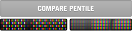
Figure 6 - PenTile RGBW display

The format in Figure 6 is the RGBW that is used by PenTile. The advantage of this format is that it allows one-third of the subpixels to be eliminated, reducing the number of column drivers, increasing the open area (aperture ratio) of each subpixel and adds a white (clear) subpixel to let even more light through the panel. Overall, this has the benefit of almost doubling the light throughput of an LCD display. It does all of this without compromising our ability to reduce the chrominance resolution below that which can be perceived.

So, if there is more than enough data for luminance resolution and more than enough for chrominance resolution, some might ask why is it that we can see screen door effects on fully saturated green on black or frailty of fully saturated red or green, single stroke diagonal lines on black? The data supports the fact that we have represented the luminance perfectly at every pixel and the chrominance to the level that the HVS can perceive, yet we can still see something different than for RGB stripe.

This is known as pattern visibility. Visibility of the pattern is carried on the luminance channel, so we have sensitivity of this to 30 cycles/degree. When a block of solid bright saturated color, such as green, is displayed, a checkerboard of green and black, representing lines and spaces, in both diagonals, is visible in the luminance channel at 21 cycles per degree.

Consider also that a single stroke diagonal line of a saturated color. Since in this case we are not using the W subpixel, this is reduces the cycles/degree by a factor of square root of 2 due to the geometry, or about 21 cycles/degree in this example. If that diagonal is fully saturated green on black we will have cut the luminous channel cycles/degree by one half since we are not lighting up any other subpixel, so it has the appearance of 21 cycles/degree which is well within our sensitivity for detection. For this reason it is important to design PenTile displays only for sufficiently high resolution. Such pattern visibility will be detected at 33% higher dpi than would be the case for RGB stripe.

Just as with half tone printing if you were to fabricate this at too low of a dpi or were to look at this with an eye loop, the HVS cannot blend together the subpixels to cause us to see them as pixels. Instead we see the subpixels and the pattern that was used to form them. Done correctly the dpi of the color should be at least 30cycles/degree for us to fully fuse the colors and to be unaware of their exact locus. Looking from a very close distance or with a magnifier violates the premise of the design to keep these subpixels at levels of 30 cycles/degree or higher.

We are only now at the bottom end of the utility range for PenTile. This is a technology that anticipates the need for still higher resolution and the requirement for higher efficiency when we do so. As the industry goes to 300 dpi screens for phones and tablets we are well in the range for PenTile to add more value and to have little or no detectable artifacts.


Engadget on the Motorola Photon 4G

It is good to see the thorough review by Engadget of the Motorola Photon 4G. http://engt.co/q4whbJ This Motorola phone has already been recognized for its ability to achieve high brightness with long battery life. Saving half the power with PenTile RGBW is no small part in making this happen as the display backlight is a significant consumer of phone power.

The specific comment by Myriam Joire of Engadget was “…With its stunning display, impressive battery life and solid performance, the Photon 4G comes very close to dethroning Samsung’s mighty Galaxy S II as king of the Android hill…”

I had the experience last week of going to a Sprint store to look closely at the Photon PenTile RGBW LCD display. While I was there a young woman, whose eyes had better acuity than mine, was hunting for a new phone. She complained of the battery life of her current smartphone (unsolicited comment I swear). I told her why the Photon was better than her current phone in that regard. In the spirit of full disclosure I told her that some bloggers were complaining of some artifacts in this display. I asked her to see if she saw anythings wrong with the display. When she couldn’t, I pointed out the pattern visibility issue for the battery indicator. She couldn’t see it, so I lent her my eye loop. She could then see it, but said “So what? If this saves my battery life I could care less.”

By the way, in the recent software update for the Atrix I noticed that Motorola addressed the pattern visibility in the battery indicator with some changes that have eliminated the pattern visibility on this icon.

I hope that more reviewers like Engadget begin to put a little weight on battery life, brightness, and overall performance.